Step-by-Step Guide to Creating and Customizing Digital Cards: Templates, Colors, and Button Styles
15 mins read · Updated 01 Oct, 2025
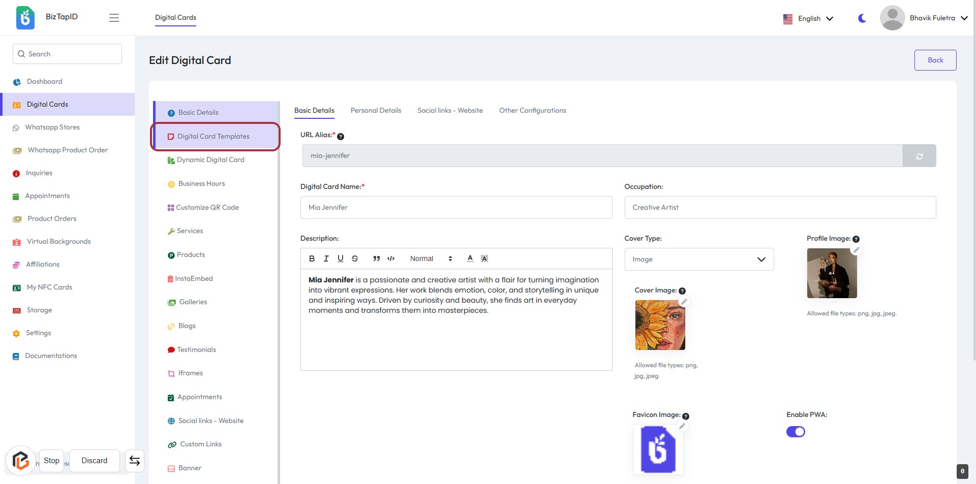
STEP 1: Click on "Digital Card Templates" to Access Card Editing Options
- Navigate to Digital Card Templates in the sidebar.
- Click on the highlighted link to access the editing interface.
- Fill in required fields marked with an asterisk (*):
- URL Alias: Enter a unique identifier.
- Digital Card Name: Provide the name for the card.
- Optionally, add details in the Description section.
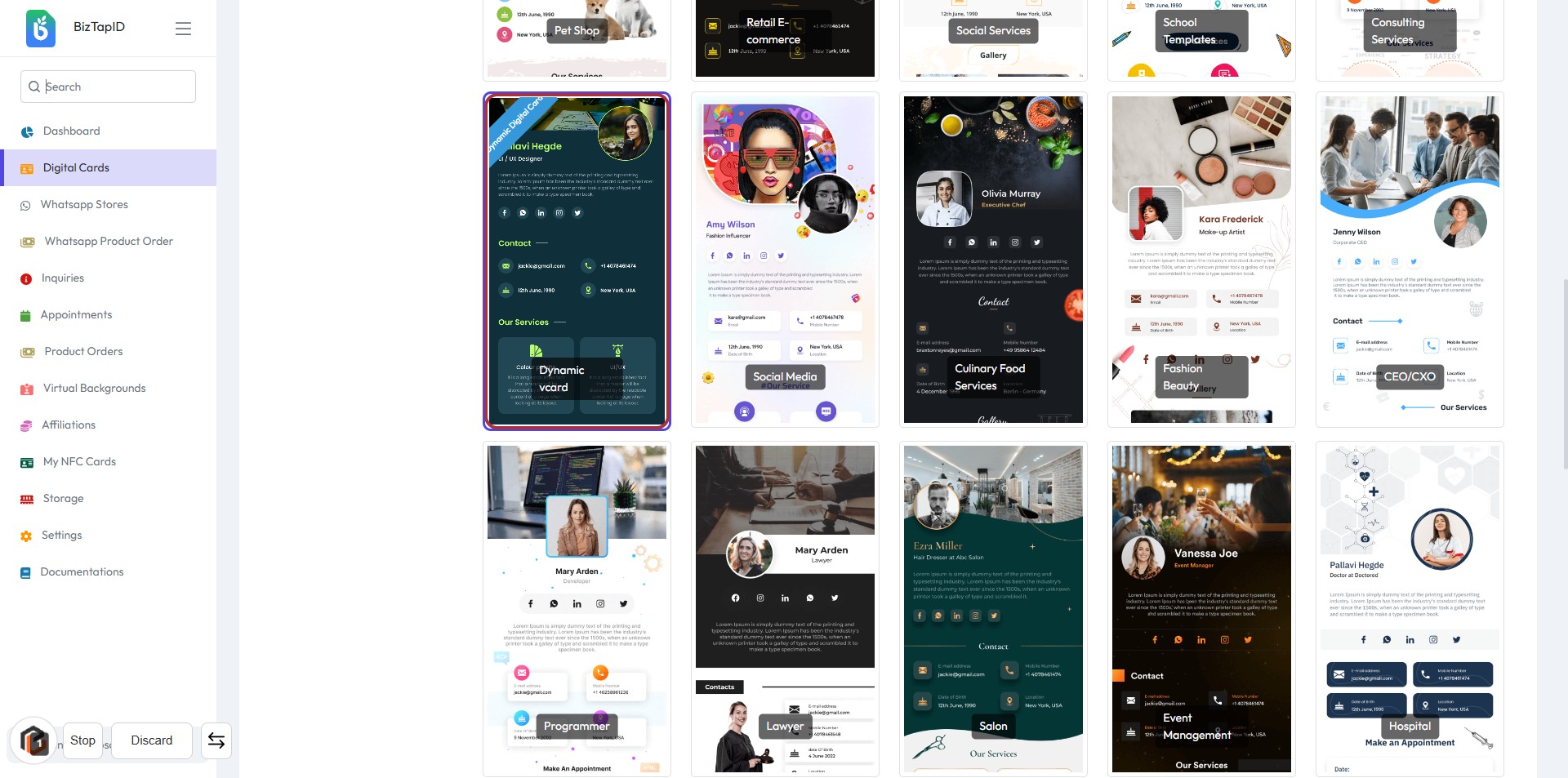
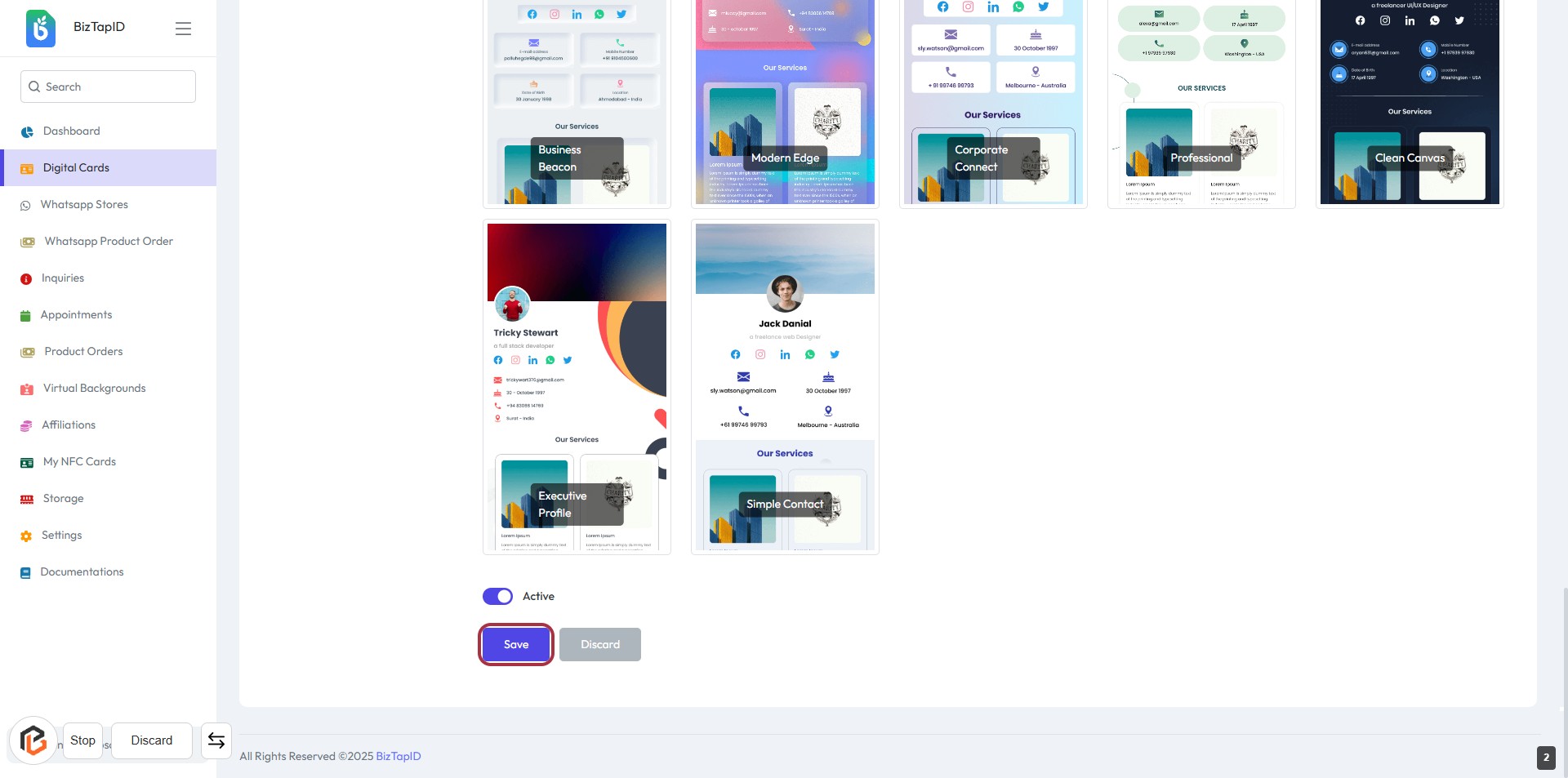
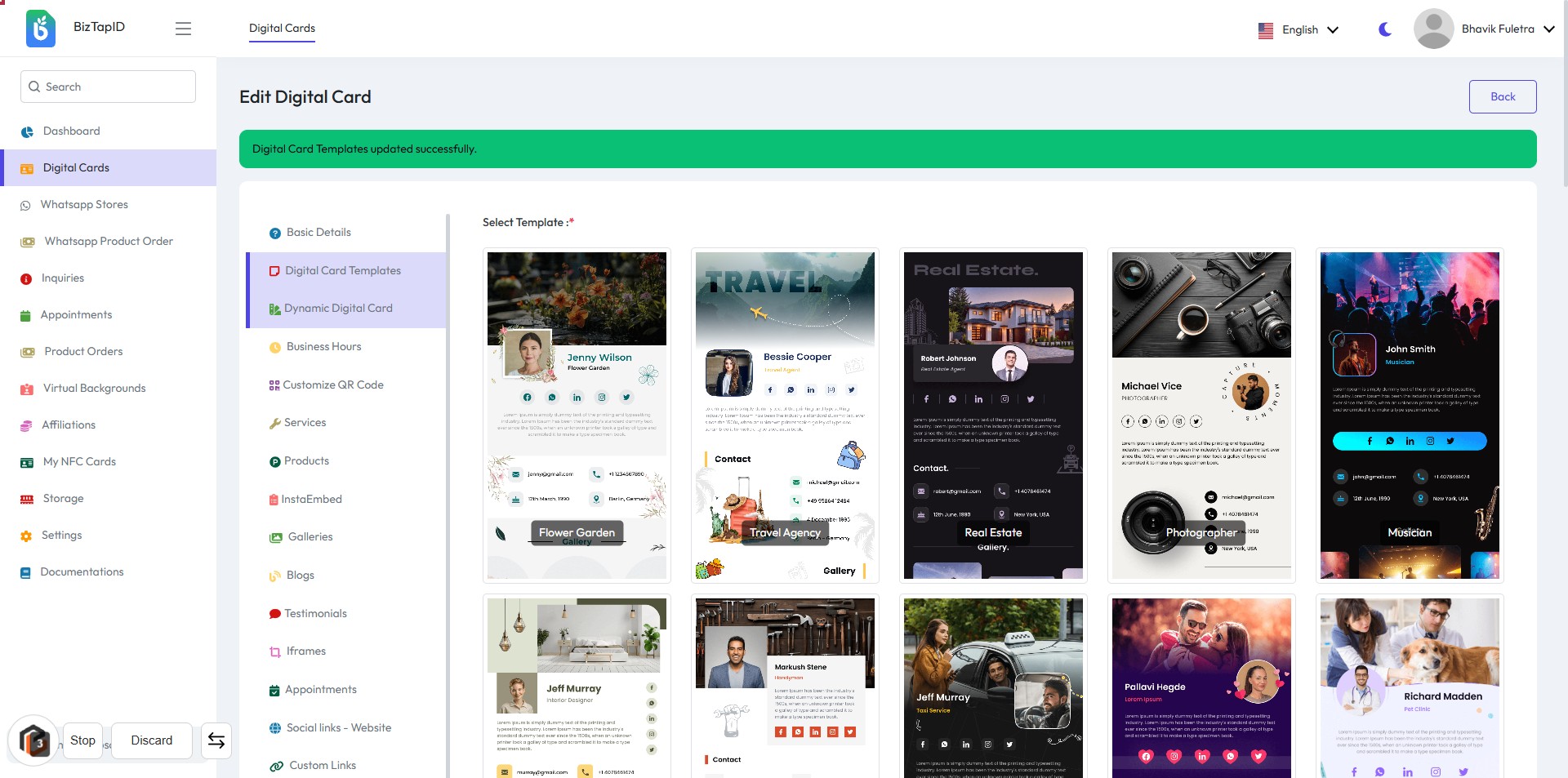
STEP 2: Select "Dynamic vCard" Template
- Click on the "Dynamic vCard" template highlighted in the card layout.
- Ensure you are on the correct screen: Digital Card Templates.
- Review the template options available to find the one that suits your needs.
- Proceed to the next step by clicking the "Save" button after selection.
STEP 3: CLICK on "Save" Button
- Ensure all required fields are filled in the form.
- Review the information entered for accuracy.
- Locate the "Save" button at the bottom of the form.
- Click the "Save" button to save your changes.
- Proceed to the next step by clicking on "Dynamic Digital Card."
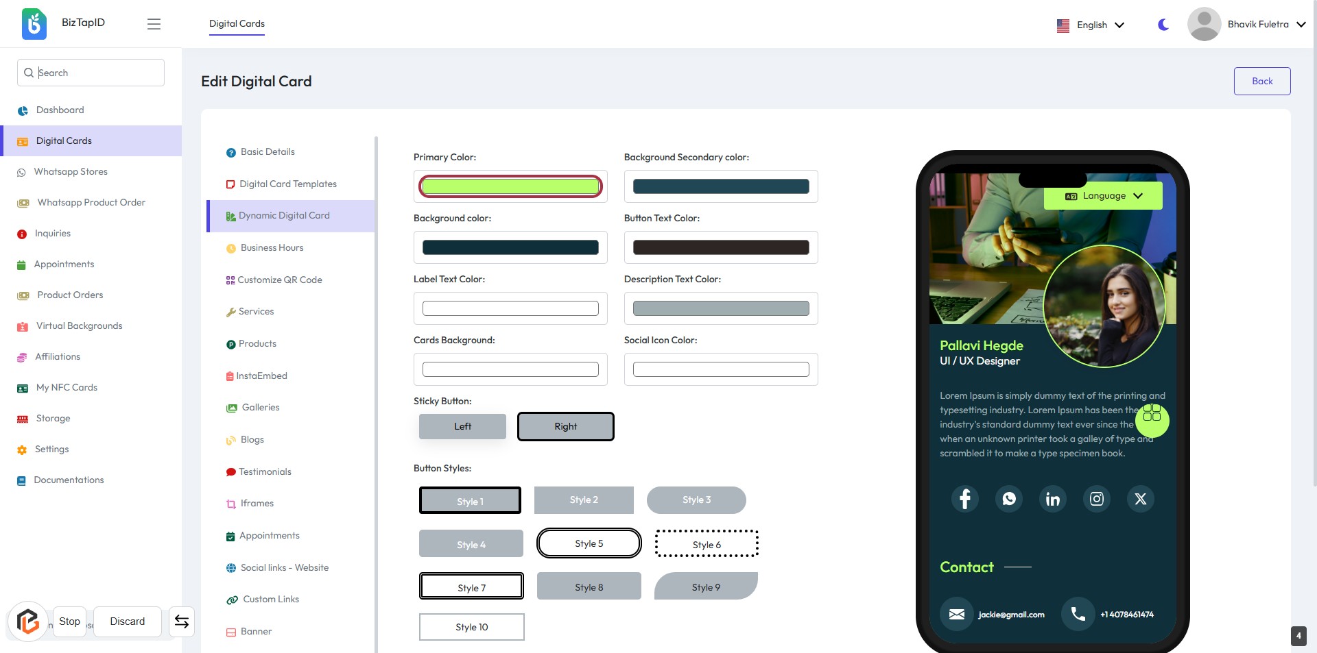
STEP 4: Click on "Dynamic Digital Card"
- Navigate to the "Dynamic Digital Card" option in the sidebar.
- Click on the highlighted area to access the template selection.
- Ensure you have completed the previous step by saving your changes.
- Review the available templates displayed for selection.
- Proceed to the next step to select the "Primary Color."
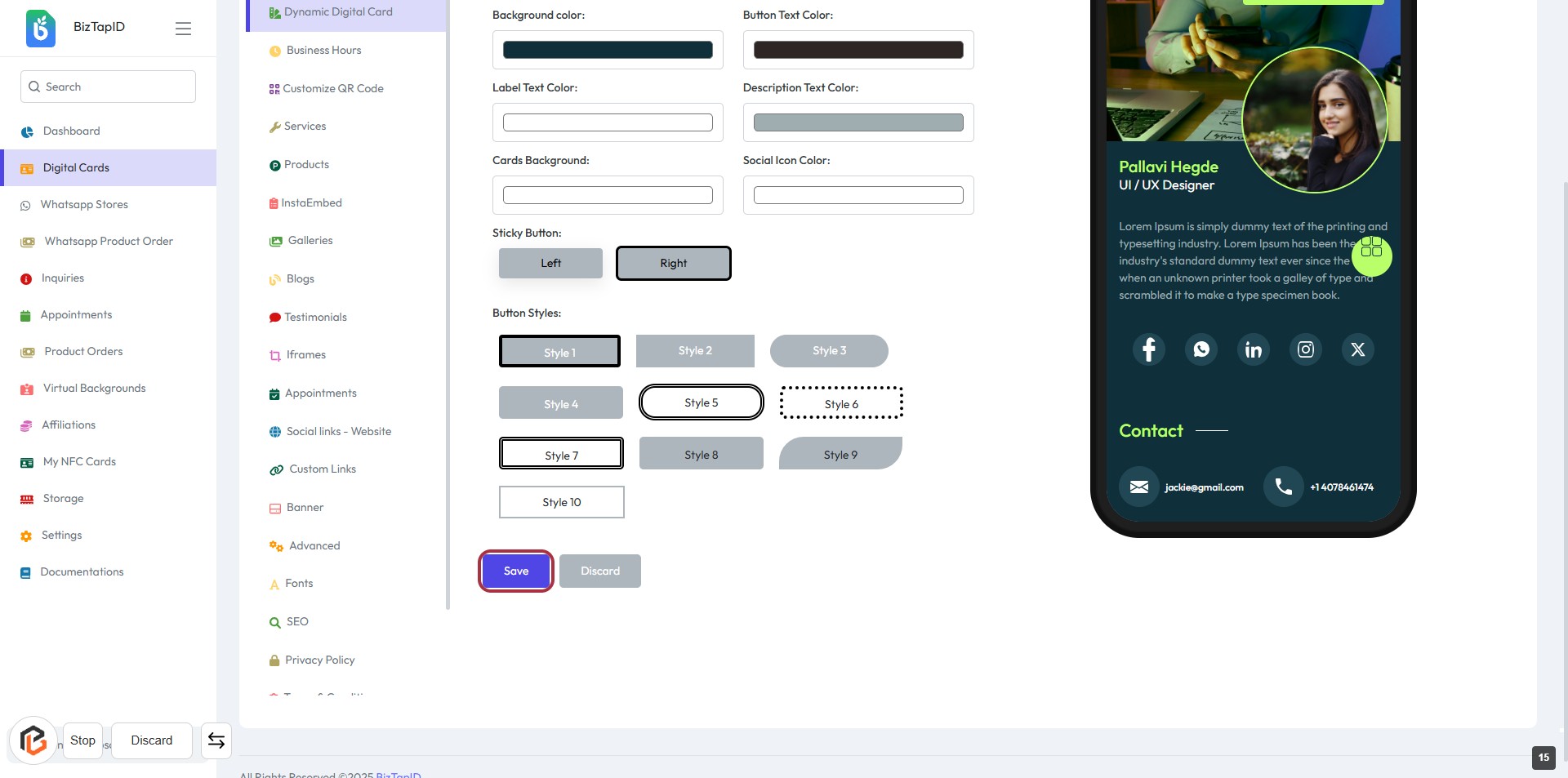
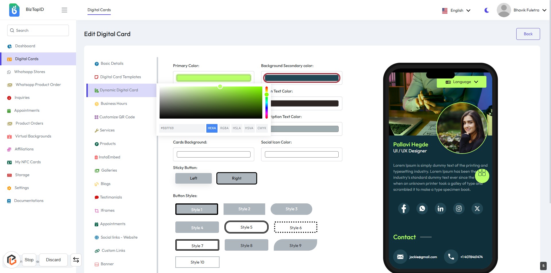
STEP 5: Select "Primary Color"
- Click the "Primary Color" button to choose your desired color.
- Ensure the color selection aligns with your branding.
- Review other color options available, such as Background Color and Button Text Color.
- Proceed to the next step to select the "Background Secondary Color."
STEP 6: Select "Background Secondary Color"
- Click the button labeled "Background Secondary color:" to open the color selection tool.
- Choose your desired secondary background color from the color palette.
- Ensure the selected color complements the primary color for a cohesive design.
- Proceed to the next step by selecting "Background Color."
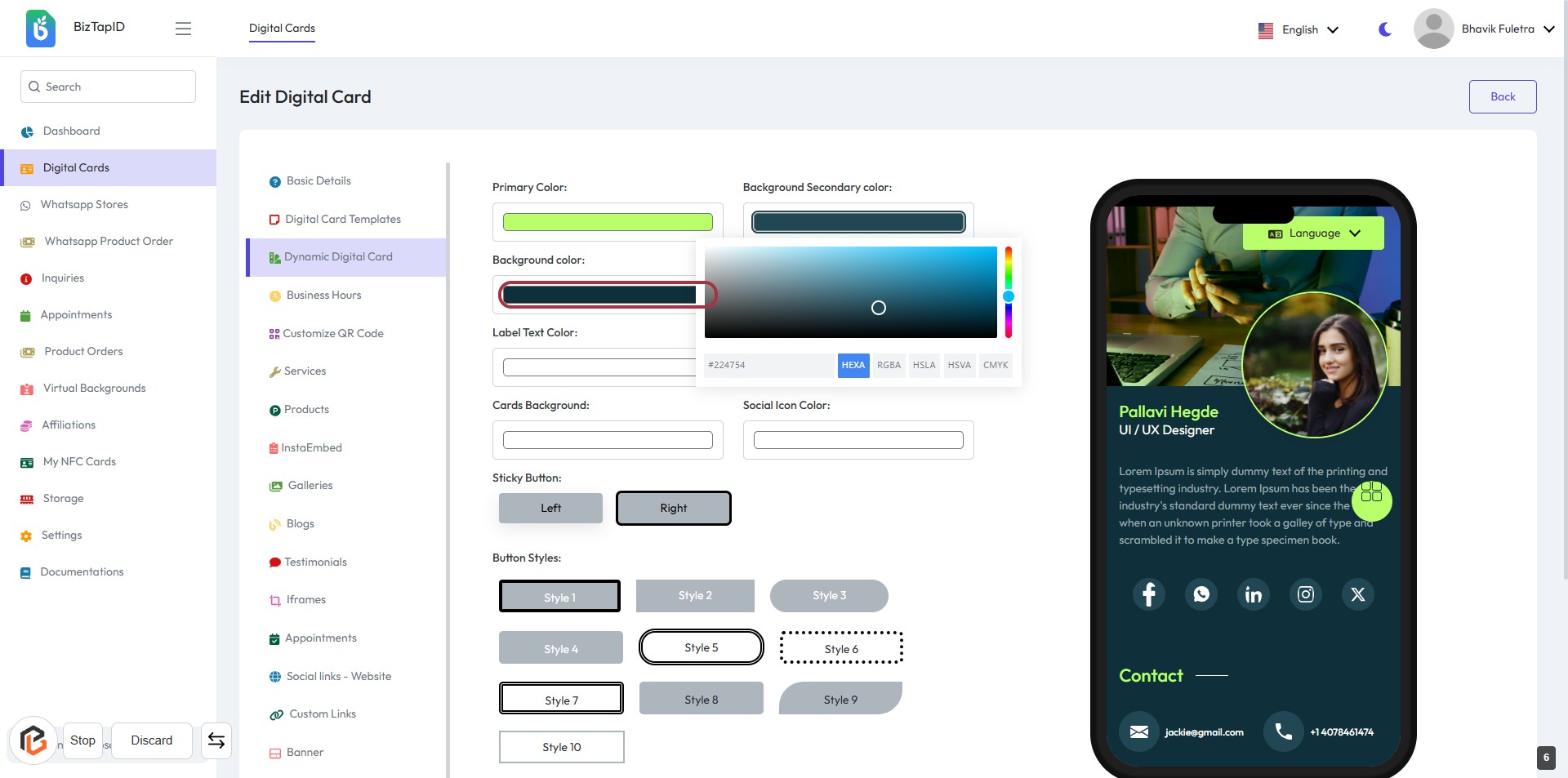
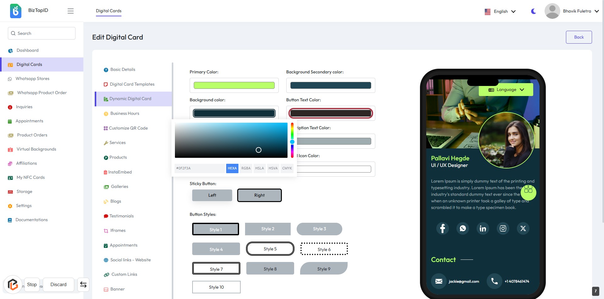
STEP 7: Select "Background Color"
- Click the Background color button to open the color picker.
- Choose your desired background color from the color palette.
- Ensure the selected color aligns with your design preferences.
- Review the changes in the preview section on the right.
STEP 8: Select "Button Text Color"
- Click on the "Button Text Color" button to open the color selection tool.
- Choose your desired color for the button text from the color palette.
- Ensure the selected color meets your design preferences.
- Review the changes in the preview section to confirm the appearance.
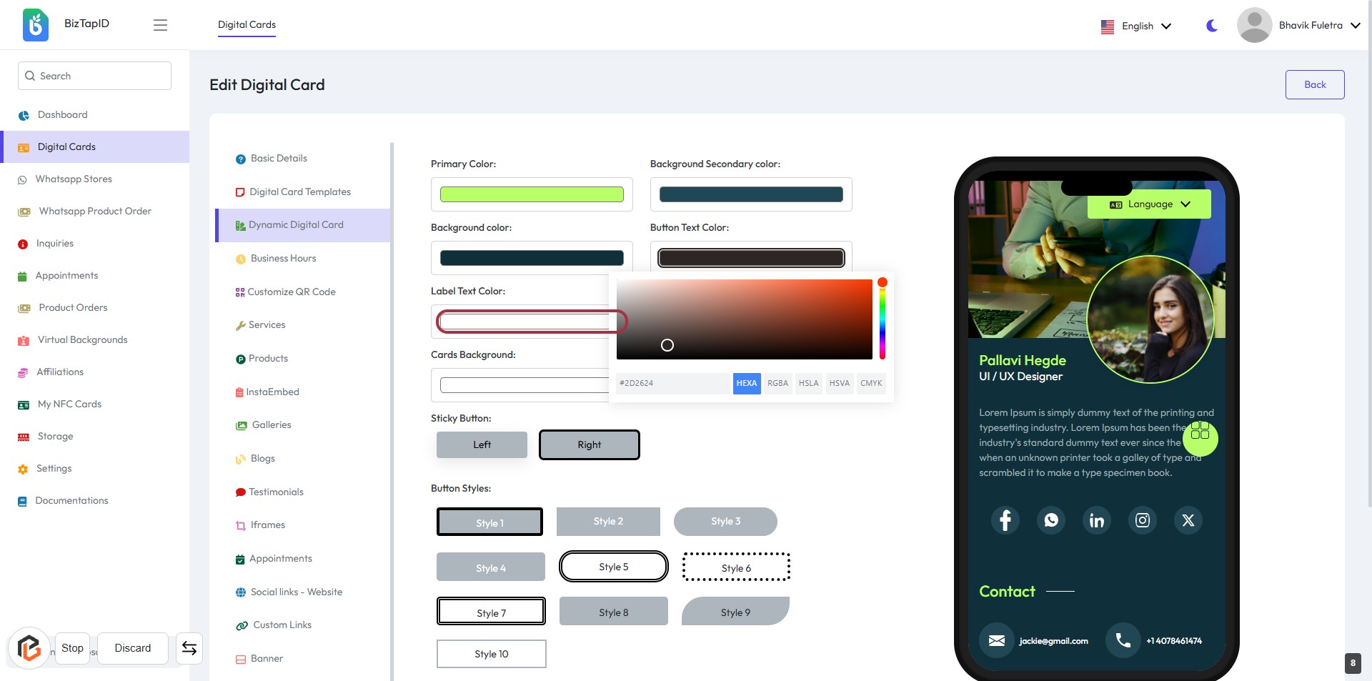
STEP 9: Select "Label Text Color"
- Click on the "Label Text Color" button to open the color selection tool.
- Choose your desired color for the label text from the color palette.
- Ensure the selected color meets your design preferences.
- Review the changes in the preview section to confirm the appearance.
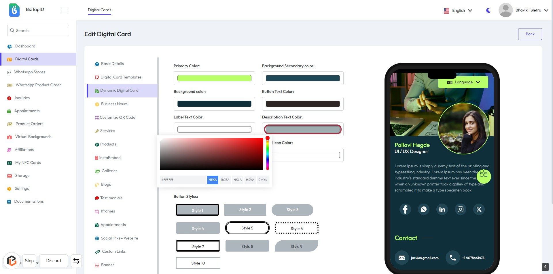
STEP 10: Select "Description Text Color"
- Click the Description Text Color button to open the color picker.
- Choose your desired color for the description text.
- Ensure the selected color meets your design preferences.
- Review the changes in the preview section on the right.
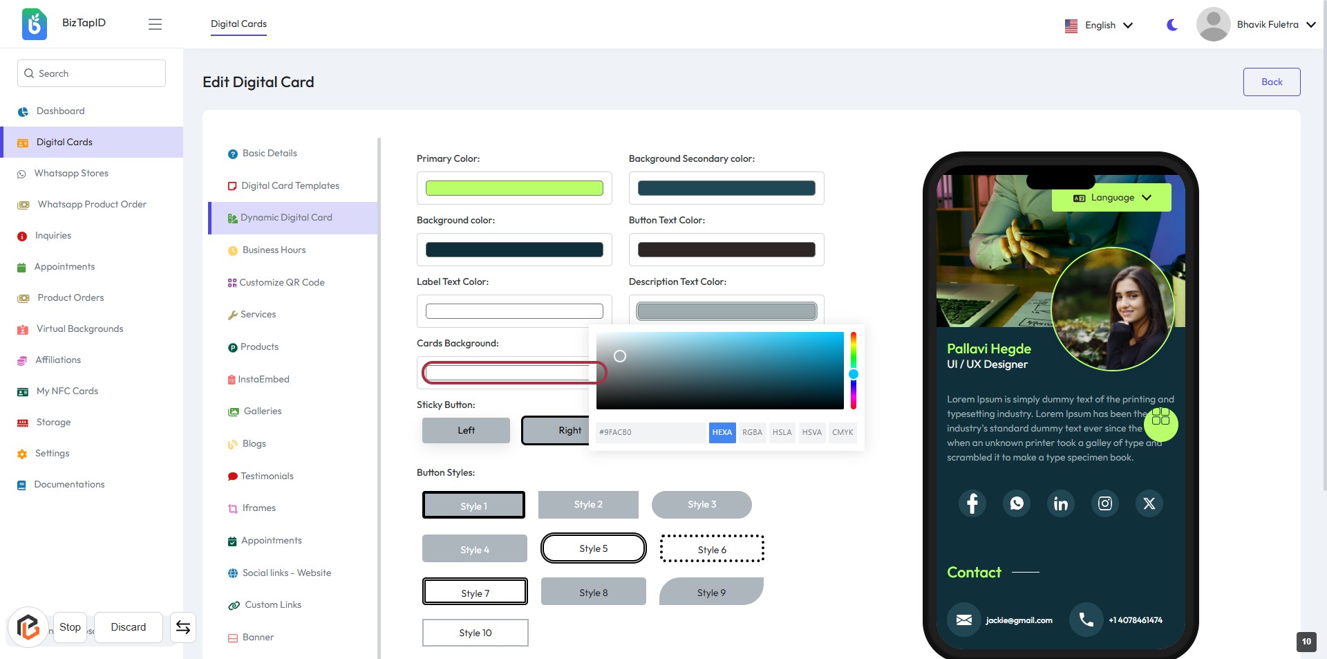
STEP 11: Select "Cards Background"
- Click the button labeled "Cards Background" to choose a color for the card's background.
- Ensure to select a color that complements your design.
- The selected color will be reflected in the preview on the right side of the screen.
- After making your selection, proceed to the next step to adjust the "Social Icon Color."
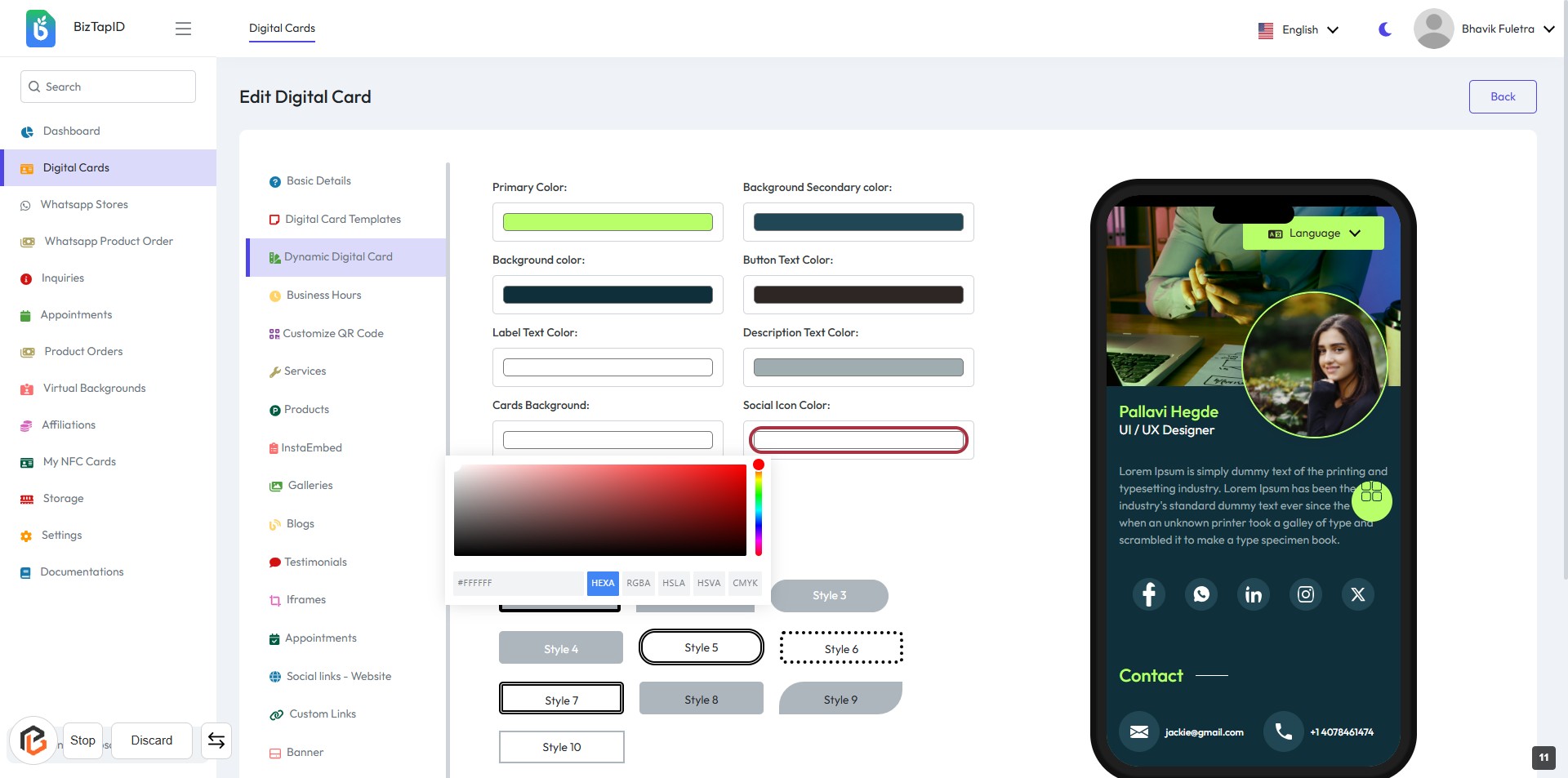
STEP 12: Select "Social Icon Color"
- Click on the Social Icon Color button to choose the desired color for your social media icons.
- A color picker will appear; select your preferred color.
- Ensure that the color aligns with your overall card design.
- Review the changes in the preview on the right side of the screen.
STEP 13: Select "Sticky Button" Option
- Click on the "Sticky Button" section in the form.
- Choose between "Left" or "Right" options based on your preference.
- Ensure to review other related settings like Button Styles for a cohesive design.
- Proceed to the next step to select your desired button styles.
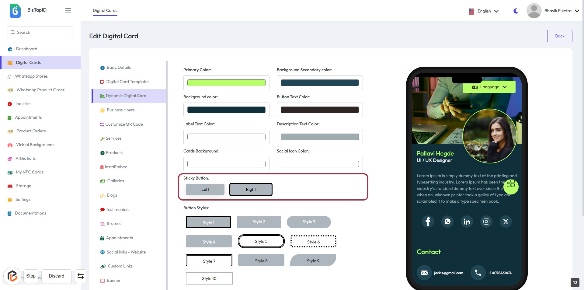
STEP 14: Select "Button Styles"
- Click on the "Button Styles:" section to view available options.
- Choose from the displayed button styles (Style 1 to Style 10).
- Ensure to review the styles visually to find the best fit for your design.
- Proceed to the next step by clicking on the "Save" button.
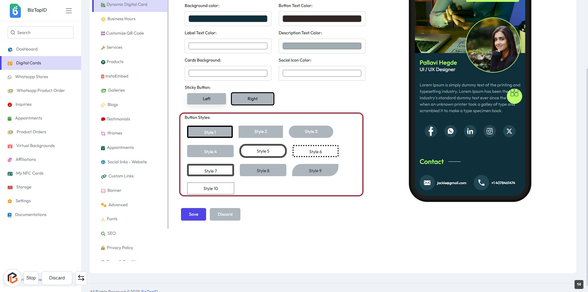
STEP 15: Click on "Save" Button to Finalize Changes
- Ensure all required fields are filled out before proceeding.
- Locate the "Save" button highlighted in the form.
- Click the "Save" button to apply your changes.
- Review any confirmation messages that may appear after saving.